logo and brand identity design
of Luce
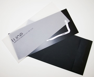
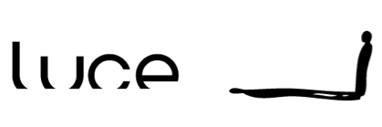
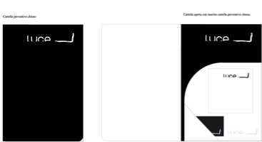
Il logo sfrutta il concetto di luce: la si identifica soltanto attraverso la proiezione del suo contrario, l’ombra. Il logo è dunque un gioco di luci ed ombre. Per la comunicazione istituzionale e above the line, un deciso bianco e nero, mentre per la comunicazione below the line, il logo è reso visibile solo dallo stagliarsi della luce. Utilizzando un nuovo concetto di logo: un logo pressochè invisibile, se non per la sua finitura lucida. E’ dunque attraverso la riflessione stessa della luce che, ad esempio, un semplice invito monocromatico rivela il brand ed incuriosisce il pubblico.
The logo exploit the concept of light: you identify light only trough the projection of it’s contrary, the shadow. The logo consequently is a conjuring trick of light and shadows. For the communication above the line a decisive black and white.
For the communication below the line, the logo is visible only by a struck of light in this way obostudio uses a new concept of logo; an almost invisible logo, you can only see it when the light shines on it!
A simple monochrome invite revealing the brand while intriguing potential clients.
mercoledì 10 settembre 2008